

Butter Yellow: How to Wear and Use This Soft, Versatile Color
Quick answer
Butter yellow is a soft, muted, warm-toned yellow, named for its resemblance to the pale golden color of butter, sitting between a true pastel yellow and a richer, more saturated mustard tone. It has become a popular color across fashion, nail polish, and home decor specifically because its muted warmth is easier to wear and style than a brighter, more saturated yellow, while still offering more visual interest than a plain neutral. Choosing the right shade of butter yellow, and pairing it correctly, depends more on its warm undertone than on treating it like a typical bright yellow.
If you searched “butter yellow,” you are most likely trying to figure out how to wear or style this specific shade, whether it suits your skin tone, or how to incorporate it into an outfit, manicure, or home decor scheme without it looking overly bold or mismatched. This guide covers all of that with practical, specific guidance.
What makes a color “butter yellow” specifically?
Butter yellow sits in a specific, fairly narrow part of the yellow color family: warm, muted, and soft, without the brightness of a true canary yellow or the deeper, more golden intensity of a mustard shade. The color’s appeal comes largely from this restraint. It reads as warm and cheerful without the boldness that makes brighter yellows harder to incorporate into an outfit or space.
This distinguishes it clearly from other yellow-family shades that are often mentioned alongside it:
| Shade | Description | How it differs from butter yellow |
|---|---|---|
| Butter yellow | Soft, muted, warm pale yellow | The baseline reference point for this comparison |
| Pastel yellow | Very light, slightly cooler yellow | Lighter and less warm than butter yellow |
| Mustard yellow | Deeper, more golden, muted yellow | Darker and more saturated than butter yellow |
| Canary yellow | Bright, highly saturated yellow | Much bolder and more attention-grabbing than butter yellow’s muted quality |
| Lemon yellow | Bright, slightly cool-toned yellow | Cooler and more vibrant than butter yellow’s warm softness |

Does butter yellow suit every skin tone?
Yellow tones are often considered one of the more challenging colors to wear close to the face, but butter yellow’s muted, warm quality generally makes it more universally wearable than a brighter yellow shade.
- Warm undertones: butter yellow tends to be especially flattering, since its warmth complements warm skin naturally
- Cool undertones: the color can still work well, particularly in smaller doses like an accessory or accent, though a slightly softer or more diluted version may feel more balanced than a fully saturated butter yellow garment
- Neutral undertones: generally have the most flexibility in wearing butter yellow across a range of applications
- Deeper skin tones: butter yellow tends to read as rich and warm against deeper skin, often considered one of the more universally flattering applications of this shade
- Fairer skin tones: a slightly deeper or more golden version of butter yellow can help avoid the color washing out against very fair skin, compared to the palest, most diluted versions of the shade
As with any color guide, personal preference and confidence in wearing a shade matter as much as general undertone theory.
Butter yellow in fashion
Clothing
Butter yellow has become a popular choice for both statement pieces, like a dress or coat, and smaller doses, like a blouse or accessory, specifically because its muted quality makes it easier to wear as a larger portion of an outfit compared to a brighter yellow.
Color pairings that work well
- Butter yellow and white: a clean, classic combination that lets the color’s softness stand out without competition
- Butter yellow and denim: the warm-cool contrast between butter yellow and blue denim is a widely used, reliable pairing
- Butter yellow and brown or camel: both being warm tones, this combination creates a cohesive, earthy palette
- Butter yellow and gray: gray’s neutrality allows butter yellow to stand out as the outfit’s main point of visual interest without clashing
- Butter yellow and other pastels: particularly soft lavender or sage green, for a coordinated, gentle color-blocked look
Common butter yellow pieces
Sweaters, blouses, dresses, and coats are among the most common garment types where butter yellow appears, since the color’s softness works particularly well in fabrics with some visual texture, like knits, rather than in very flat, glossy fabrics where a muted color can sometimes look less dynamic.
Butter yellow nail polish
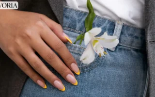
Butter yellow has become a popular nail color specifically because it offers a bright, cheerful option without the starkness of a fully saturated yellow polish, which some find difficult to apply evenly or wear close to the skin on the hands.
- Works well in both a glossy crème finish and a matte finish, with each creating a noticeably different overall effect
- Pairs well with simple, minimal nail art, like a thin white line accent or a small negative space design, since the color itself already provides visual interest
- Can be prone to showing streaking if applied too thin, making an even, slightly thicker application, or two coats, generally advisable for a smooth, opaque finish
Butter yellow in home decor
Butter yellow has also become a popular choice in interior design, particularly for spaces where a warm, inviting but not overpowering color is desired.
- Accent walls: a common way to introduce the color without committing to an entire room in yellow
- Textiles: throw pillows, curtains, and rugs offer a lower-commitment way to incorporate butter yellow into a space
- Kitchen and dining spaces: the color’s warm, food-associated undertone (echoing its buttery namesake) makes it a popular choice for these specific rooms
- Pairing with neutrals: cream, white, and warm wood tones tend to complement butter yellow particularly well in interior applications, keeping the overall palette from feeling overly saturated
Common mistakes people make with butter yellow
- Confusing it with a brighter or more saturated yellow when shopping. Product photos and lighting can sometimes make butter yellow appear more vibrant than it actually is in person, leading to a color that reads differently than expected once received.
- Applying nail polish too thin. Butter yellow, like many pale, warm-toned polishes, can show streaking if applied in a single thin coat, making a proper two-coat application important for an even, opaque finish.
- Overcommitting to an entire room in butter yellow without testing first. Since lighting significantly affects how warm, muted colors like this one read in a space, testing a small swatch or sample area before committing to a full room is a reasonable precaution.
- Pairing it with overly cool-toned colors without considering contrast. While not a strict rule, very cool-toned pairings can sometimes clash with butter yellow’s inherent warmth more than warm or neutral pairings do.
- Assuming it works the same in every fabric or finish. The same butter yellow shade can look notably different in a matte cotton fabric compared to a glossy or satin fabric, which is worth considering when shopping for clothing specifically.
Actionable recommendations
- Check product photos against real-life reviews or in-person swatches when shopping for butter yellow items, since lighting can make the shade appear more saturated than it truly is.
- Use butter yellow in smaller doses, like an accessory or accent nail, if you are unsure whether the color suits you before committing to a larger piece or space.
- Apply nail polish in two even coats to avoid streaking, which is a common issue with pale, warm-toned polishes.
- Pair butter yellow with warm or neutral tones, like white, camel, or gray, for the most versatile and easy-to-style combinations.
- Test paint or fabric swatches in actual lighting conditions before committing to a full room or large piece in butter yellow, since lighting significantly affects how the color reads.
Frequently asked questions
What is the difference between butter yellow and mustard yellow? Butter yellow is lighter, softer, and more muted, while mustard yellow is deeper, more golden, and more saturated.
Does butter yellow suit all skin tones? Its muted, warm quality makes it more universally wearable than a bright yellow, though warm undertones tend to find it especially flattering, while cooler undertones may prefer using it in smaller doses like an accessory.
Is butter yellow a warm or cool color? Butter yellow is a warm-toned color, distinguishing it from cooler, brighter shades like lemon yellow.
What colors pair well with butter yellow? White, denim blue, camel or brown, gray, and other soft pastels like lavender or sage green all pair well with butter yellow’s warm, muted quality.
Why does my butter yellow nail polish look streaky? This is a common issue with pale, warm-toned polishes when applied too thin. Using two even coats generally produces a smoother, more opaque finish.
Is butter yellow a good color for a kitchen? Yes, it has become a popular choice for kitchens and dining spaces specifically because its warm, food-associated undertone feels inviting without being overpowering.
How is butter yellow different from pastel yellow? Pastel yellow tends to be lighter and slightly cooler, while butter yellow has a warmer, richer quality despite still being a relatively soft, muted shade.
Can butter yellow be worn year-round? Yes, though it is often especially associated with spring and summer. In cooler months, butter yellow works well in heavier fabrics like knits, keeping the color relevant across seasons through fabric choice rather than avoiding it entirely.
The bottom line
Butter yellow’s popularity across fashion, beauty, and home decor comes down to the same core quality: its muted, warm softness makes it significantly easier to wear and style than a brighter, more saturated yellow, while still offering more visual interest than a plain neutral. Understanding its warm undertone, pairing it thoughtfully, and testing the shade in real lighting or on your actual skin tone before committing to a larger piece are the details that make the difference between butter yellow looking effortlessly chic and looking slightly off.
Read More: Fall Nail Colors: A Complete Guide to Shades, Pairings, and Picking the Right One

[…] Read More: Butter Yellow: How to Wear and Style This Color […]